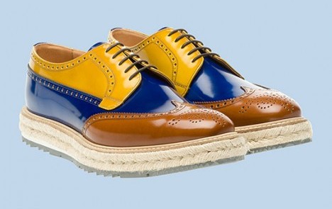
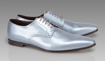
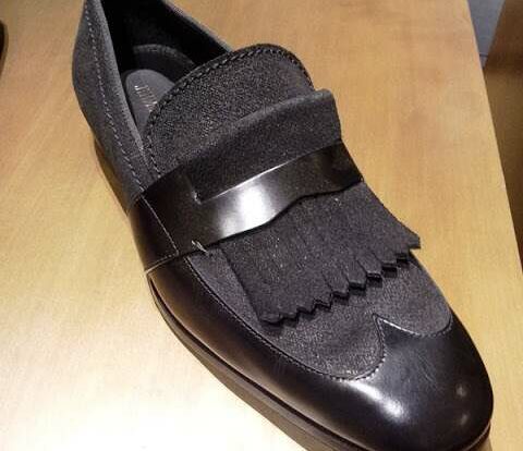
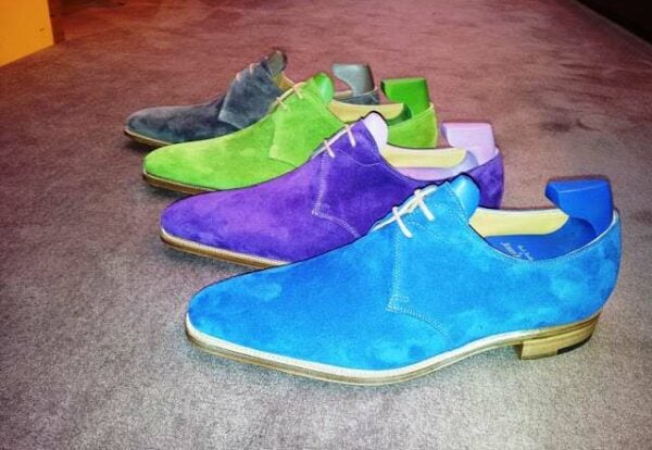
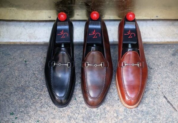
I don’t know how many of you have noticed, but 2011 definitely started off as the year that bold colored shoes have become significantly more prominent in the shoe industry. For me this breakthrough is amazing, but the only downfall is that I feel that many of the shoe companies attempting to introduce more color into their shoe lines, skipped all subtlety and went straight for gaudy. Let’s take Prada (pictured above), for example, who has been making all of the headway with their new tri-colored shoe with a sharp edge-cut sole trim and a one inch (2.5 cm) hemp braided sole with storm welt. Seriously??? That shit is ugly! I mean, I can appreciate the colors, but to then add all of this unnecessary stuff is just a little bit much. It’s like the industry went from repressed black shoe producing to using 47 colors coupled with a space-aged sole on their shoes?? What happened to that middle step?
Obviously, ‘designers’ will be ‘designers’ but still, let’s not carried away. Using colors outside of the normal spectrum for shoes should be carried out in an elegant way, or those who may have always been color-adverse, will be even more so when they see these monstrosities. Baby steps Mr. and Mrs. Designers of the world! Or else there will always be this divide between those who wear only black shoes and those who wear this crap here. It makes me wonder who they try and reach with this product. I guess that they are not looking to gain new clientele but instead only keep the one’s they have happy. How do they grow, in terms of a business model? Maybe just by upping the prices? Because seeing these shoes, certainly would not make me want to go buy D&G or Prada products, it actually makes me want to avoid the store all together.
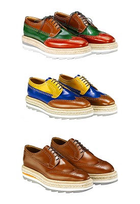
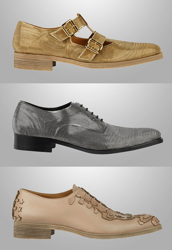
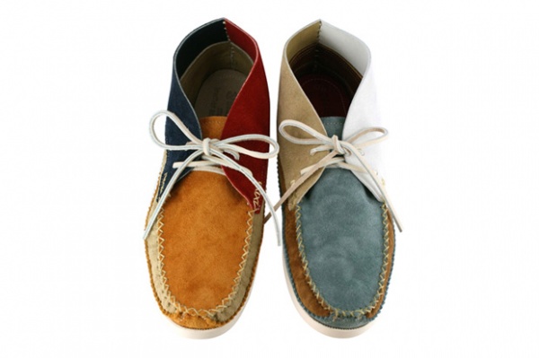
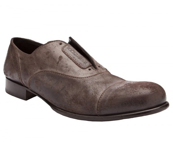
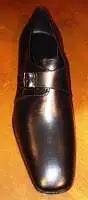
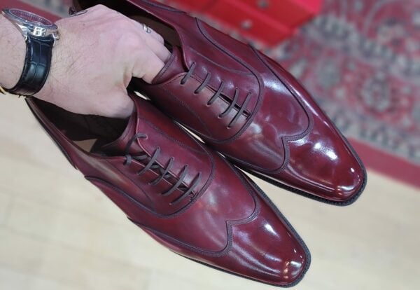
What saddens me is that even Paul Smith, a company that I actually like, came out with some of this crap (pictured below). I mean, I don’t think shoes made with reflector type looking pleather will ever be cool. And those pointy toes that could kill an ant in the corner of your room, just have to go. I know that these British companies make those, thinking that they are ‘Italian style’ but in reality, no Italian wears that pointy shit. They usually wear an elongated round toe, plain and simple. And who would ever think that Christmas colors would look good in a shoe (as Prada apparently did)? I could understand if they added white in there, to make the colors of the Italian flag but, they didn’t, they added brown, of all the ‘third’ colors they could have added. It’s just strange to me, it’s almost like they were thinking, ‘hey, let’s take the three ugliest colors combined and put them into a shoe.’ And viola, they achieved just that!! Now I hate to be a pessimist, but it is just strange that very few companies get it right, as the Japanese company, Saion, did in the post below. It really is not that difficult to create something different, but still have it be elegant and appealing. But hey, who am I to judge………?
Some Pictures Courtesy Of: The Shoe Buff


Totally seconded. I thought the new Prada’s were a joke when I first saw them – like “what if we glued every possible kind of sole onto each other and used leftover coloured scraps for the uppers” Frankenstein’s monster.
I patiently waited for the menswear bloggers to heap derision on them, only to be met with cautious and even wholehearted approval.
Meanwhile I shall embrace the middle step by getting myself some custom Trickers in navy blue with a red Dainite sole.
Ugly is still ugly.
http://filmdrunk.uproxx.com/2011/04/mexicans-in-pointy-boots-the-documentary
you gotta love the human spirit
Yes these Prada shoes are indeed ugly! and its not just the colors (i think they all try to copy the loud mix of colors from the sneakers industry)its these stupid soles???? but these shoes served their purpose by creating a buzz and getting press….the money comes from selling fragrances, accessories and other product licensees…..that’s the business of branding!
I still love most of what Paul smith offers for shoes, for the most part you can find quite a lot of cool wearable shoes in his collection.
Hey Justin-I was shocked to see these were prada. I mean,where is the well defined yet sleek shape they’re known for? I must say,I was toying around with the idea of a tri-colorway myself….but nothing this extreme. These colors are in drastic contrast to one another. I mean, if you were going to do a tri-color,at least have them complement each other. Have them analogous or monochromatic. This would work much better. But it all comes back to a great shape and style.
I third that motion, though thinking more closely about the issue it comes to me with no surprise. Justin, its just exactly what you said, they are looking to please their existing customers not gain new ones. This is what every style guided novel dictates. Fashion equals temporary, one moment you’re in, one moment you’re out. Where as style is permanent and timeless.
Justin, I could not agree more with your assessment. All of the big fashion labels mentioned in your post seem to have gotten way to carried away.
My humble guess as to what the designers were thinking: they tried to apply some of the same wild, attention-grabbing, flamboyance common to clothing typically displayed during run-way fashion shows. If you agree with this line of thinking, then logic would also dictate that hardly anyone ever wears the run-way clothes; they are simply meant for show. Same goes for the shoes.
As far as who would actually buy these Frankensteinesque monstrosities, I would guess hip-hop artists, rock stars, teenage celebrity, neuvo riche types with more money than taste.
Scott – Yes, it’s unfortunate how some will reserve judgment for fear of being shunned by others and therefore ride the gravy train, agreeing when they don’t really feel that way. On a positive note, your Trickers sound like they will be quite interesting. You should send me a pic when you get them!
Anonymous – Thanks for sharing! That is hilarious and very sad at the same time.
BOAZ – Indeed, Boaz, branding is key and I am sure that they knew what they were doing, even if it meant creating shoes like that. Don’t get me wrong about Paul Smith though, I still think that he is brilliant and was the pioneer to introducing color into shoes. We have that to thank him for and he still comes out with fresh and innovative designs.
Henry V. – Exactly!! Tri-color done right, could be a good thing, but yes, without good shape, it’s a bust regardless!
Julio B. – Well said!
Samir – What’s funny is that I have seen those neuvo rich types with more money than style and it is hilarious!! I once saw this guy with those lugged sole square chunky toe Berluti’s in red with an ostrich leather black coat on and this blue silk looking pants that were all baggy (but looked expensive). It was so funny, like he just bought all of this super expensive stuff and than just threw it all together thinking that he had style.
-Justin, “The Shoe Snob”