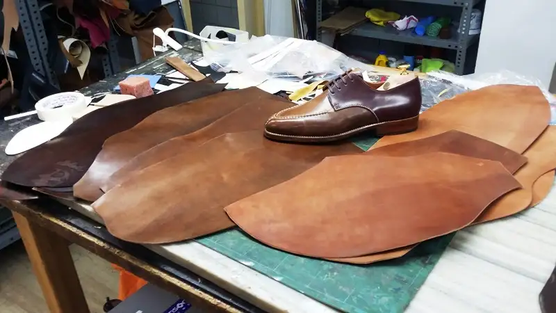
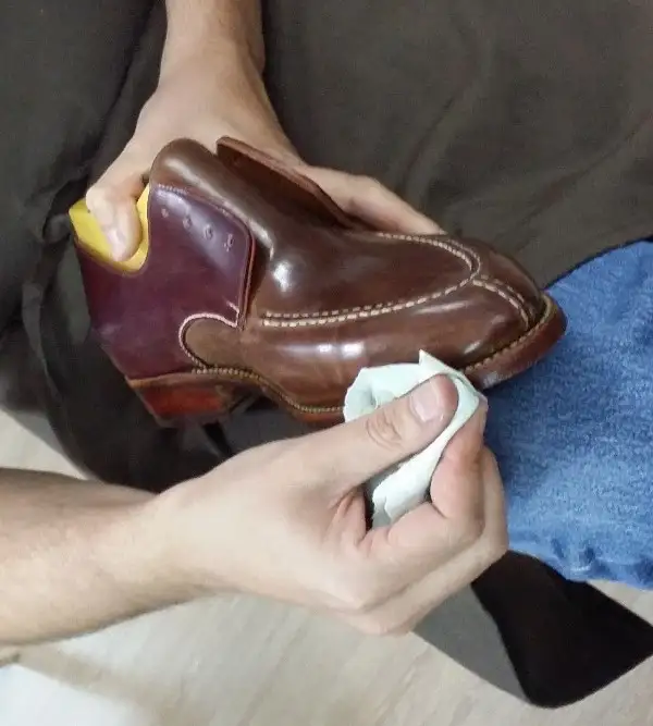
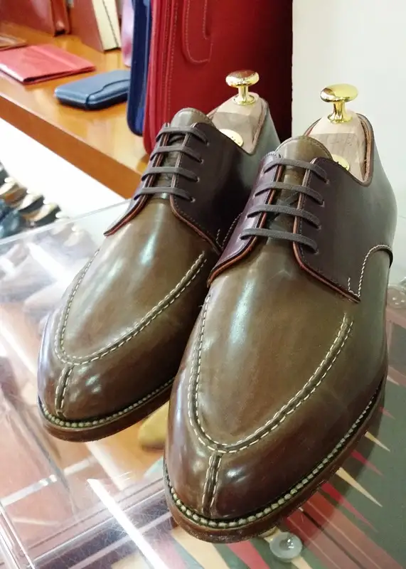
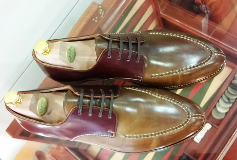
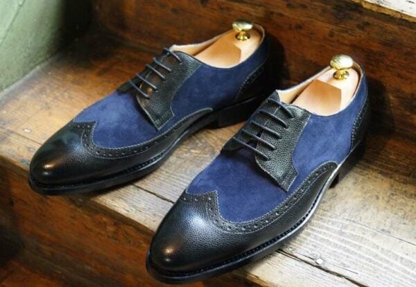
Usually I am not crazy about the split in color on a derby where the vamp/toe is one color and the quarter/counter is another. For some reason the difference between the colors splitting between top to bottom (like on a balmoral) is so much more pleasing to my eye in comparison to the colors splitting from left to right. I don’t know why this is but it is. This model by Spanish shoemaker Enrile took me by surprise though as I was not immediately unattracted to it as I normally would be. I found the subtle contrast between the classic cordovan color and the whiskey a nice combination of colors that actually complemented each other quite well. The contrast stitch then added another layer of depth to the overall look and I think as a whole package became a shoe that I found very attractive. It’s nice to see it as well as I always like it when something breaks a negative idea that I previously had towards something. Now I am going to seek out more two tones of this nature!
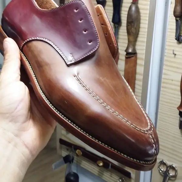
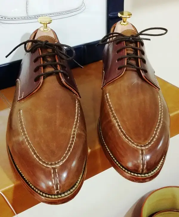
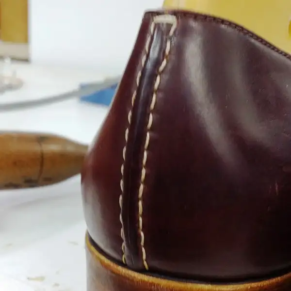

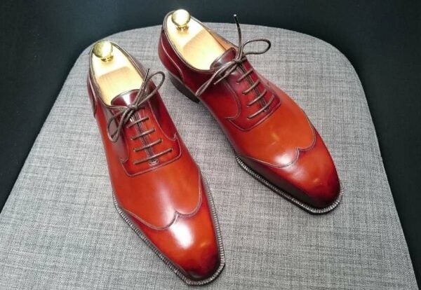
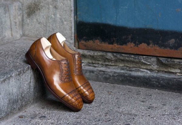
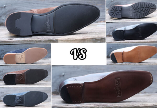
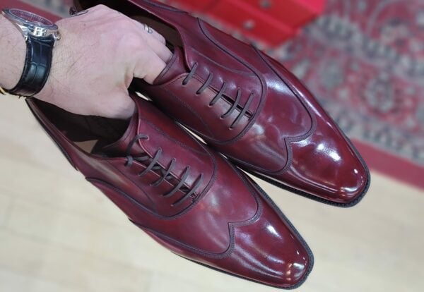

Enrile likes stitching
Perhaps, you may better have sticked to your original judgment! On the photos, I am not convinced with this combination of colors. But of course, you have seen that shoe. Yours, Giorgio.
i have not seen it in person, just in the pictures, but i like it…
I know Antonio Enrile since August 2012. I visited his store in Sevilla because I knew from him in a Spanish blog. I was really impressed of his excellent and accurate work. Since then I have ordered several items and I am specially in love of my shell cordovan belt (Oxblood 8). The bicolor shoes of this article are spectacular, specially love its esxcellent stitched. Kind regards
thanks for sharing Vicente!