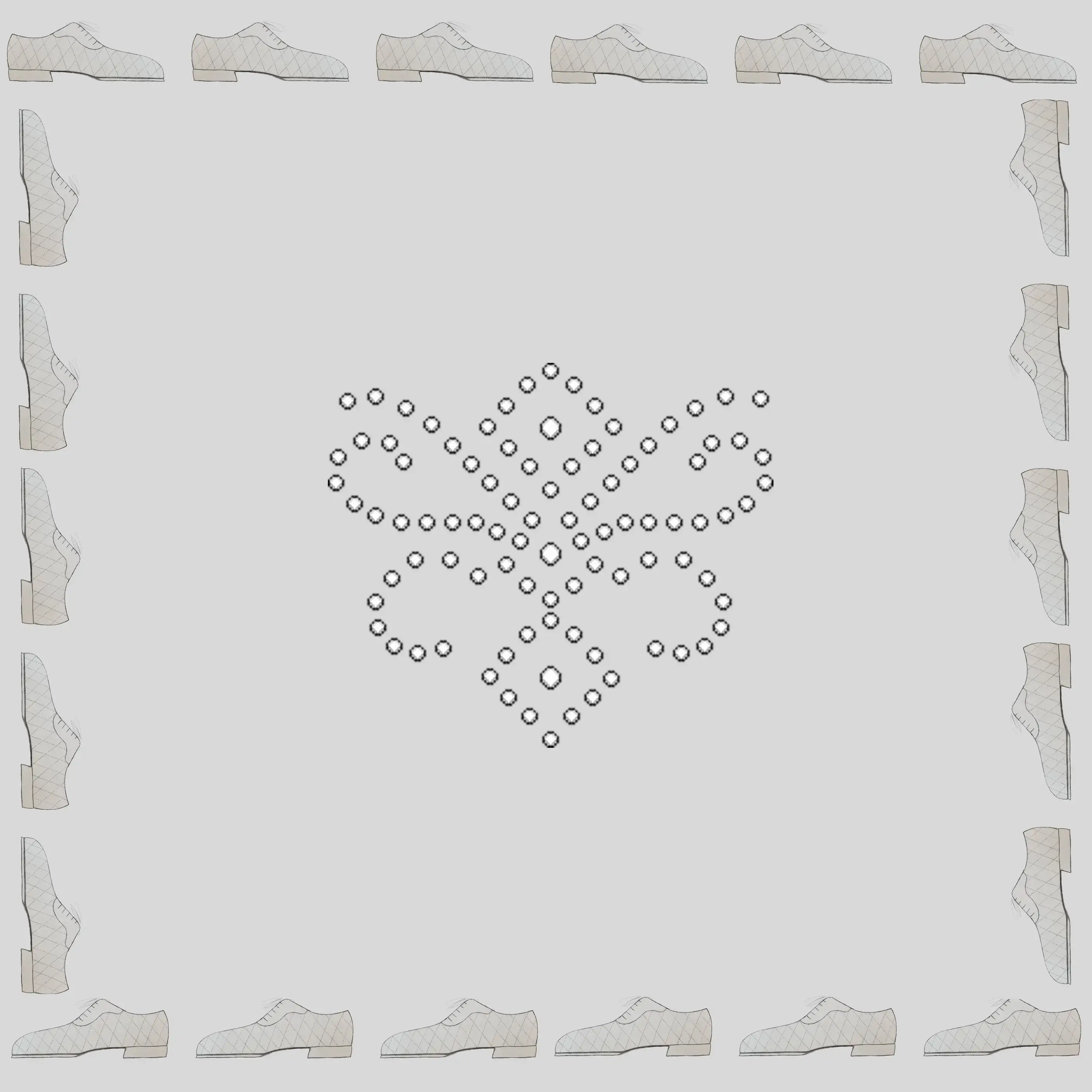
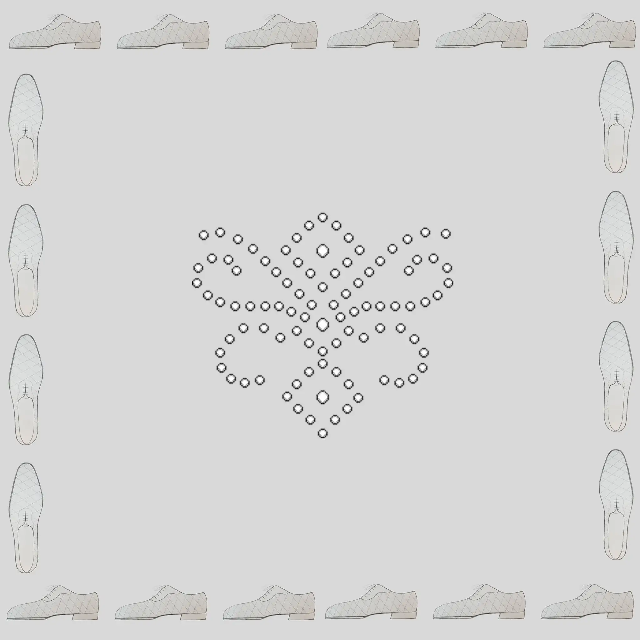
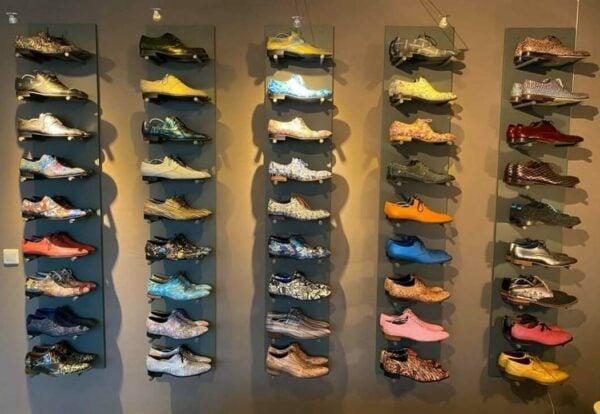
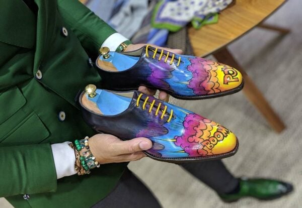
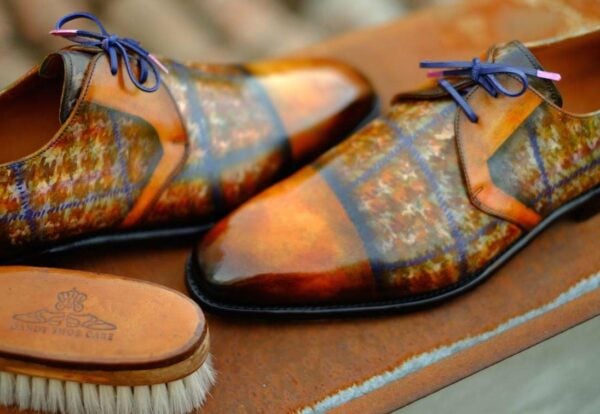
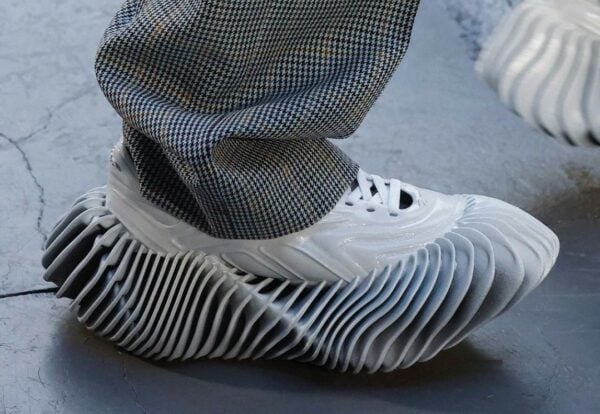
I am about to venture into a mini project of some fun nature and that is pocket sqaures. This is not a new business of mine by any means but more of a collaboration between myself and another (to be stated later). As you can see here, my role is my “shoe art” and adding that to pocket squares. Now as someone has to take a financial risk on this collaboration a little market research was requested to see what the end consumer would prefer.
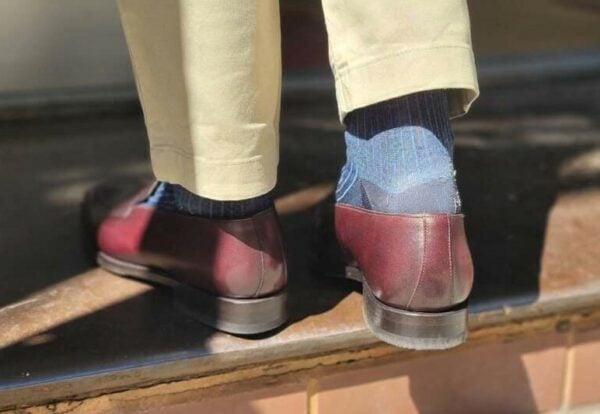
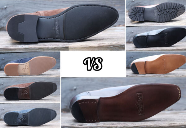
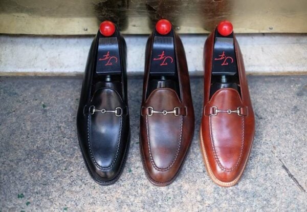
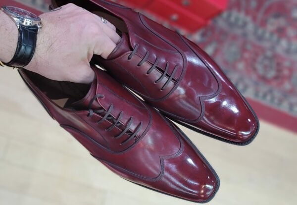
That being, we would like to get your vote on the 4 images in this post, #1 being the one above, and #2 – #4 being in sequential order from below.
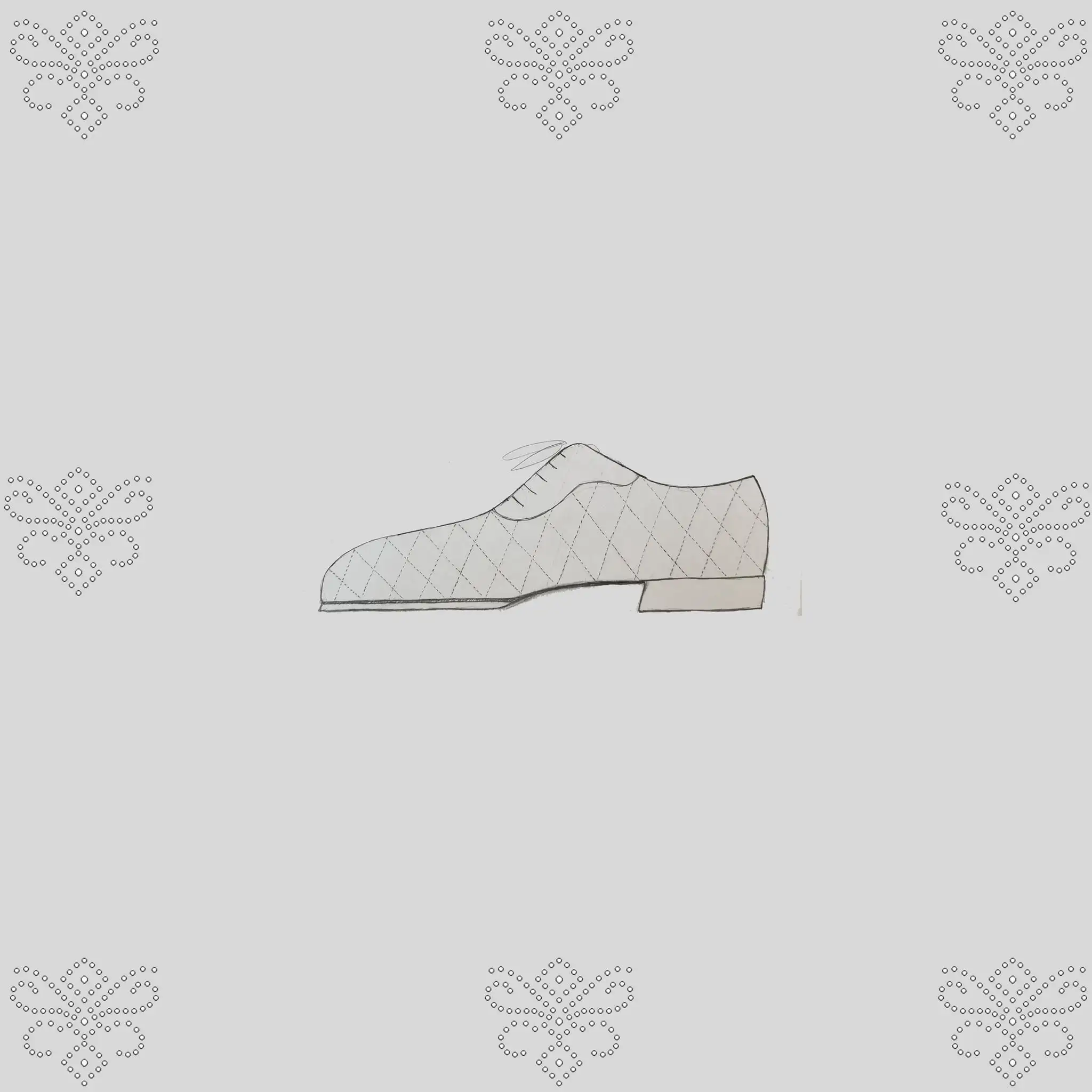
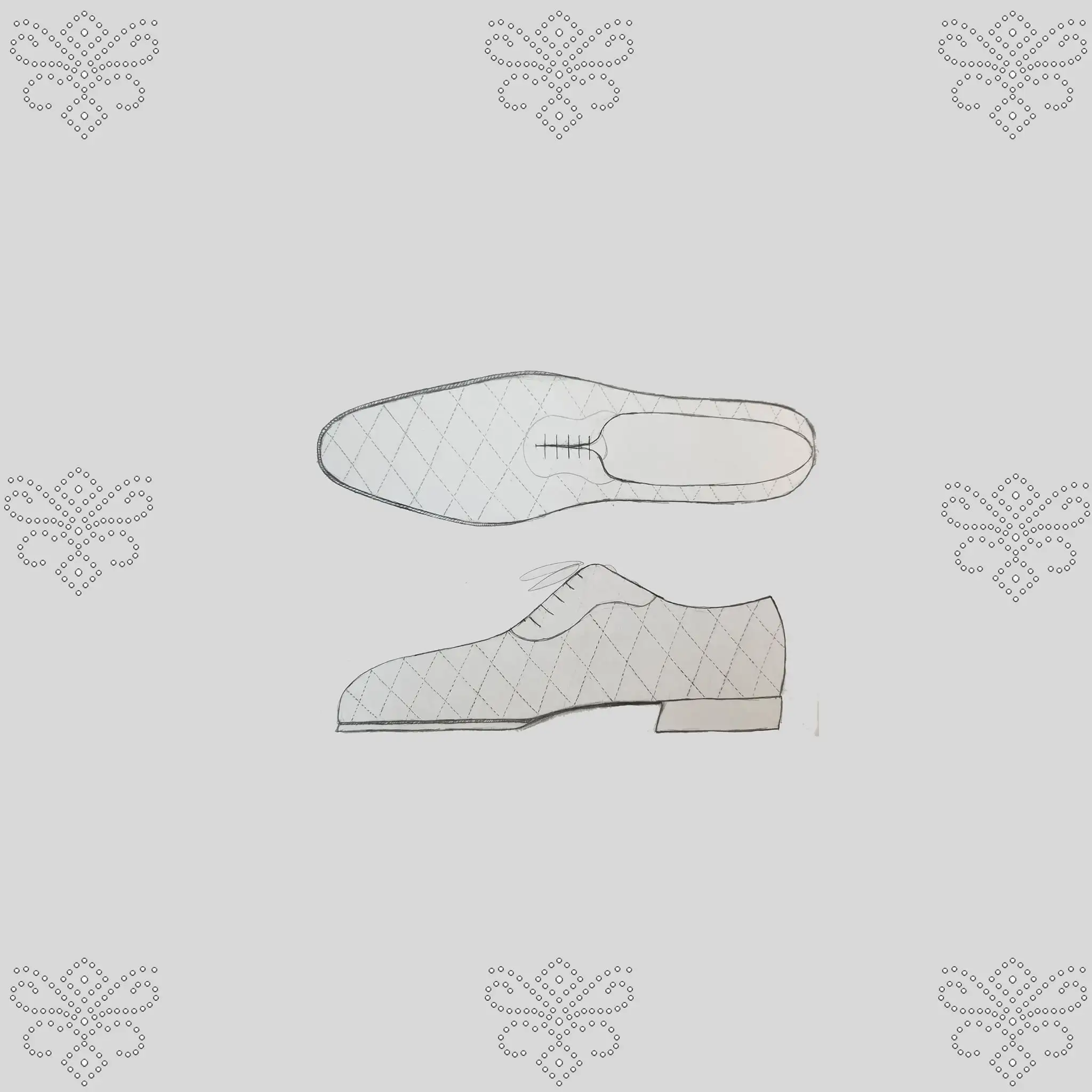
These are very much rough ideas (not necessarily being the shoe nor medallion involved) but more about the layout of the design of the pocket square.
That being, without thinking too much into the shoe or medallion used and only thinking about placement of such items, which image is your favorite for POTENTIALLY USING AS A POCKET SQUARE DESIGN???
Please comment below with your answer being #1 thru #4. You can put two if you cannot decide between them.
Thanks for all of your help!
Justin, ‘The Shoe Snob’

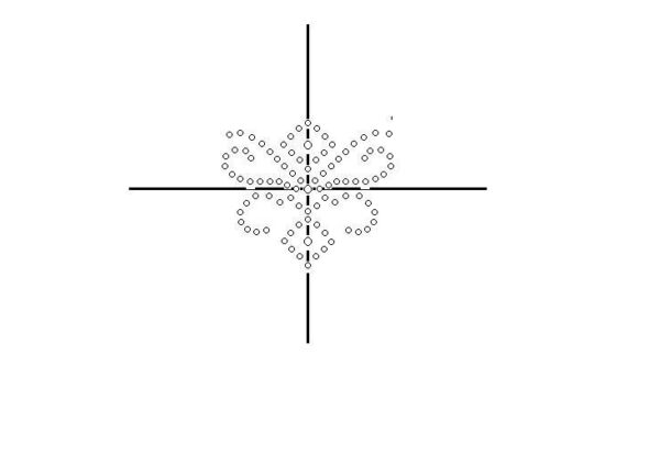

#3
I would say image 4. But as a pocket square it will rare be seen as a whole.
#1, but less the border. I think having just toe medallions would look great.
This.
#1, but just the medallion would look great.
love none but prefer #4
#1 for the border
#4 shoes rather than medallion
#1, but I do quite like them all.
#3 if monochrome or printed/embroidered in a single color on a white field, #4 if polychromed.
Any chance the medallion designs will be actual holes in the fabric?
#4 for me. #1 in a close 2nd
Number 2