As ‘The Shoe Snob,’ you can imagine that for my first prototypes, and collection for that matter, I am going to have some very high expectations. Well, 8 out of 13 of those prototypes came in the mail today. Some of them were ‘bang on,’ but sadly to say, some of them also left me quite disappointed to say the least. Now, I know that this is only the first round of prototypes (so I can’t expect magic) and many of them will inevitably be adjusted, but as this dream has been 5 years in the making, you can imagine the type of anxiety that I am going through, especially when I have been telling the whole world about it. Needless to say, as my loyal blog readers, I am presenting to you (before anyone else!) one of my first prototypes.
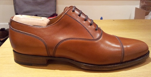
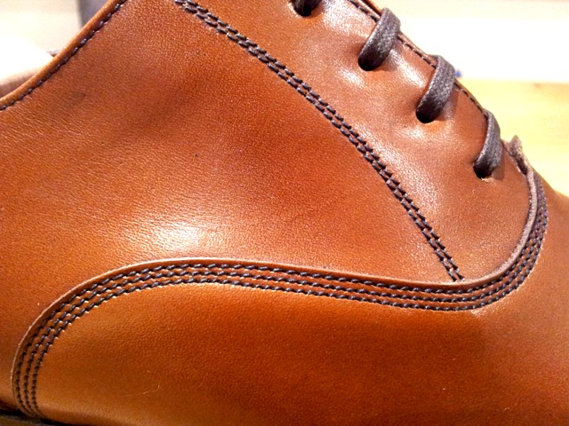
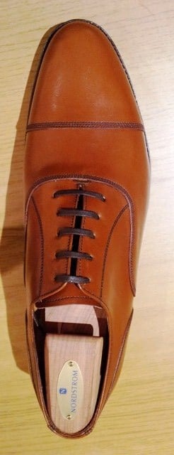
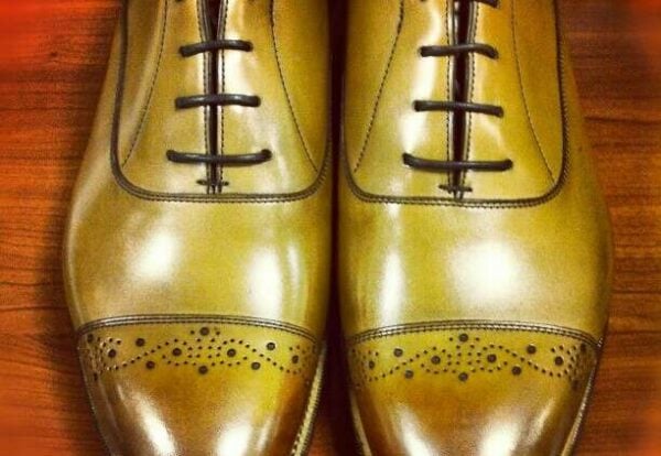
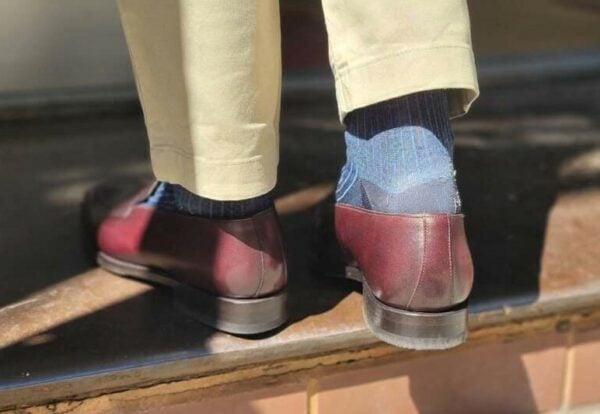
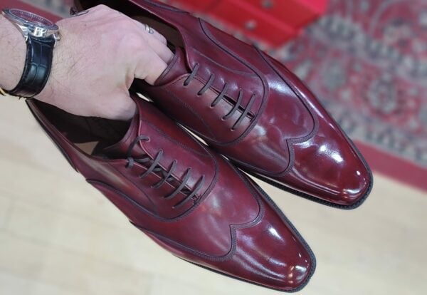
Sadly for all of you, I am only going to show this one (for now), as some of the other ones are unique. And even though I don’t intend to insult anyone of their integrity, I must be cautious as I know that there are other shoe companies who read my blog and would not want to see a design of mine released before my own shoes are. But as this may look like a classic shoe that you could find anywhere, you may have noticed that I have emphasized the stitching, providing 3 rows instead of the common 2. For me, it just accentuates the different pieces of the pattern and allows for one to wear it more casually, i.e. with a nice pair of fitted jeans. This model is nothing too unique, but then again, it’s a classic with a slight twist and that is something that can’t go wrong.
When all of the prototypes are finished, I promise that I will release them to all of you, as I know that like me, you too have been patiently waiting. Just know that I am working hard to get them out there and that I am being the biggest snob that I can, in order to bring you something unique, good looking, of good quality and of good price! So, please continue to bear with me as I finalize all of my prototypes into becoming a first collection that can wow the world….
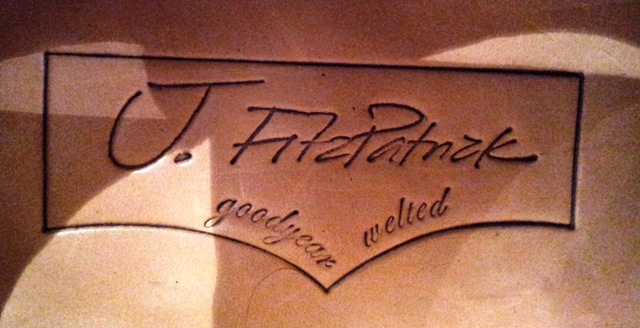
By the way, please feel free to comment. The logo is not finalized, but I would appreciate some feedback on it.


I trully like what I see… You can’t go wong with that color and style.
I like the triple stitching and the elongated shape of the shoe. Simple, but works so well.
Regards,
dsc.
Nice job! I love the design and the logo. The handwriting could use more legibility (maybe space the capital “F” and the tip of the first “t” so they’re not connected?). The 3rd row of stitching is really slick and accentuates the different pieces really well. This is a design I wish Allen Edmonds came out with, it would really make sense considering they have a lot of casual-wear designs now. Can’t wait to see the final product!
Justin- While I find the extreme variety of shoes that you feature on your blog interesting, I think you have made a brilliant choice in designing a very wearable calf skin cap toe oxford. As for the brand design, “Goodyear welting” is so common place in English bench made shoes as to be undistinguishing; I would suggest you simplify the label & drop it.
Good luck,
Steve
Color is right, toe shape is right, balance is right. The only left is the three rows of stitching instead of two. It’s just not the unique character I would give the shoe. It clutters an otherwise very versatile and brilliant first go.
Nice!
I really like the subtlety of the stitching. It adds just enough of a difference a classic captoe to make it unique. Good job on this one.
I totally understand wanting to keep your unique designs underwraps, I’m eagerly anticipating those.
As for the logo, it seems to be confused. I could be reading into this way to much, but it reminds me of a cross between “new school” with the signature, and “old time” logos with the border/goodyear welt in cursive. That is just my first impression of it. But that could also be the direction you are going in. (I will refrain from caring too much about the centering/proportions as this is just a prototype).
Nice pair
A bit of brogueing would’ve been nice though
I’m not quite sure but do the shoes have ‘chisel toes’?
Brgds
Danica
Justin,
I am so glad to finally see these after tempting us with the thought of your shoe line for so long!
They look great and I cant wait to get a pair on my feet.
topher
Justin, the shoes look great. Elegant and classic in a style that you could build on with (say) darker colours and brogueing. Logo could be clearer with a shorter tail on the J and separate the F and t.
Regards, Snapper
– love the leather (color n texture)
– love the goodyear built n stitchings
– the shoe is a bit too round for my taste
– pleaaase completely change the logo (need something much more baroque i think)
– please change your website’s banner
I love the shoes and can’t wait til you release them. I am not the biggest fan of the logo however. Have you thought about doing a small etching or emblem instead of a cursive name?
Hi Justin,
I like most of the shoe but two things. First, the cap toe seems too long to me, it sort of puts the balance of the shoe off; the creases might start appearing on the cap and not behind (or in front) of it; and if the stiffener is that long, the toes might suffer given where the shoe will “fold”.
Second, the logo is not to my taste, too aggressive and not differenciating enough.
Congrats for the job being almost done and lots of success wishes to you,
Adrian
P.S. : thanks for the lovely article on the Adri2
Justin,
The shoe breaths of elegance and soberness so with regard to the this (shape of the last and the wonderfully made stitches) I have nothin furhter to add.
However, the logo looks like a jeans pocket and I’m not sure I like that. And, as another commented, the words “goodyear welted” shouldn’t really be nessecary on this kind of shoes.
Vladimir – Thank you sir, as always!
dsc – Thank you, I was hoping that it would give a different feel to the shoe, a positive one.
Anon1 – Thanks for the info. I think that I will change the font of the writing anyway, this was literally taken from my personal hand-writing.
Steve – Thanks for the advice, I think that I will take it on board and drop it, adding it elsewhere, less visible.
The Lyle – Thanks for your input.
Jeff S. – Thank you!
Jesta1004 – Glad that you like the shoe. The logo will be updated, I made in that in a matter of seconds, just wanted to see how people felt about the overall concept of it. Thanks for the input!
Danica – A bit of brogueing will be added in the future, and I do have other shoes in my first collection that will have brogueing. It is very much a classic round toe. A chisel toe consists of defined edges. Thanks for the comment.
Topher – Thank you sir! Glad that you enjoy it. Won’t be too much longer for the rest…
Snapper – Thanks for the nice comments, logo will definitely be updated.
GWLIS – Thanks for your thoughts, but as far as my website’s banner, the ‘snob’ with the umbrella, that will definitely not be changed.
DB – Like what? Using a JF emblem instead of the name? Like how G&G do theirs? Have not thought about it, but might take it into consideration….thanks for the thought. Wouldn’t mind some ideas if you want to email them to me. Glad that you like the shoes.
Adrian – I see what you are saying. I quite like a longer cap toe myself, but I understand your concerns. I will have to have someone test wear it first I guess, to see if these issues arise. The logo will be different, that’s for sure. Thanks for wishes. Just curious about the lovely article on the Adri2, which one was that?
David – Well said. I agree as well. It will definitely be updated!
To Everyone – Thanks for all of the comments, I appreciate all of the feedback.
Sincerely,
-Justin